All products featured on WIRED are independently selected by our editors. However, we may receive compensation from retailers and/or from purchases of products through these links. Learn more.
Apple revealed Liquid Glass as part of its WWDC announcement this June, with all the pomp usually reserved for shiny new gear. The press release promised a “delightful and elegant new software design” that “reflects and refracts its surroundings while dynamically transforming to bring greater focus to content.” Today it launches globally onto compatible Apple devices.
If you haven’t encountered it yet, brace yourself. Inspired by visionOS—the software powering the Apple Vision Pro mixed reality headset—Liquid Glass infuses every Apple platform with a layered glass aesthetic. This is paired with gloopy animations and a fixation on hiding interface components when possible—and showing content through them when it isn’t.
The reaction during the summer’s public beta program was divisive. And while some people just hate change, Liquid Glass does invite criticism. Instead of sharpening focus, it too often muddies it due to legibility issues and distracting visual effects. On Mac, controls are overly prominent, yet on iPhone, they are relentlessly eager to disappear into a new Apple take on hamburger menus, denying users the chance to build effective muscle memory.
At times, Apple even verges on parody. Its press release talked of “establishing greater harmony between hardware, software, and content,” which in practice often means further blurring the line between interface and content and slapping huge rounded corners that echo the iPad’s screen onto every Mac and iPad window. The result: chopped-off content and a baffling disregard for more conventional rectangles, the most efficient shape in the history of multi-window computing.
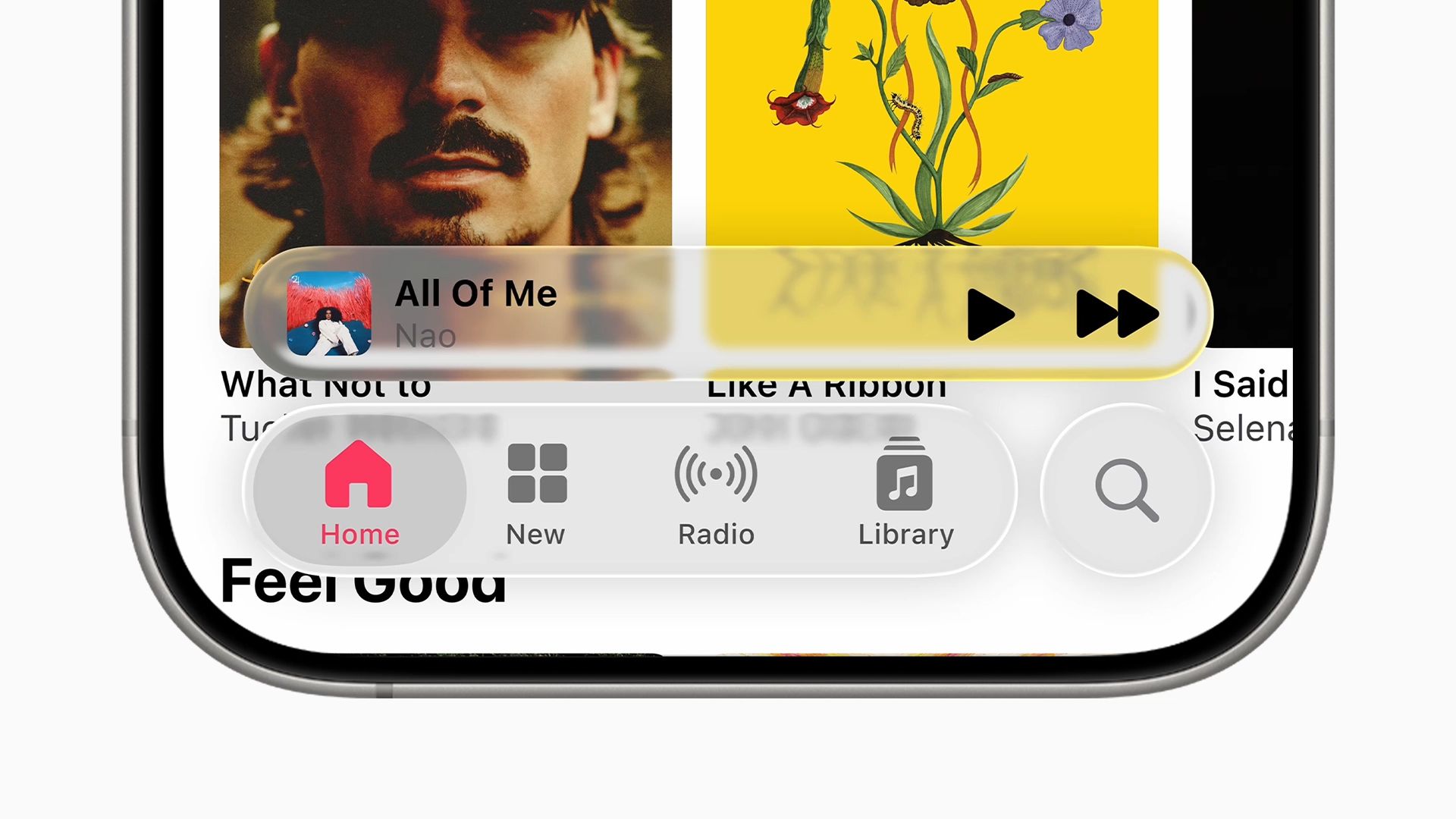
Apple’s own press images champion a desktop devoid of color, making it tricky to distinguish between a row of “etched glass” icons.
COURTESY OF APPLE
Style Over Substance?
Jonas Downey, designer of Hello Weather, doesn’t entirely buy Apple’s pitch: “I dig Apple and weird flashy stuff and am impressed with a lot of execution details in the glass concept. But the new interfaces feel complicated and overbearing, with Apple imposing its own aesthetic ideas on everyone else. I could get on board if there was an obvious benefit,” he adds, “but I haven’t seen one beyond the old adage that user interfaces should get out of the way of content. That’s a fine principle, but Liquid Glass too often does the opposite.”
He reels off a list of issues. Translucent components causing distraction. Low contrast making it harder to differentiate elements. Excess shading and dimension on buttons and tabs making them pop more than the content beneath them. This, he says, can result in friction rather than focus. “Liquid Glass splits the difference between flat and skeuomorphic design, landing in a fragile middle space,” he concludes. “By trying to become more floaty and deconstructed, the system ends up more visually complex.”
For Ben McCarthy, creator of Obscura Camera, there’s at least promise in the “Liquid” part of the equation: “Dynamic Island was praised for its fluidity—how it expanded and contracted like viscous ink. Liquid Glass seems born of similar thinking, in that animations should be fun, dynamic, and rooted in material behaviors—and that aspect is hugely successful.”
The “Glass” part, though? Not so much. “Apple’s goal is to blend interface and content to reduce distraction, but I think Liquid Glass achieves the opposite,” McCarthy says. “It creates distortions that catch your eye as content scrolls. There are fundamental legibility issues, because Liquid Glass can’t control what passes behind it. And as the system tries to adapt, flipping between light and dark to stay readable, that only further adds to the distraction.”
The iPad menu’s glassy blurred backgrounds often make text hard to read.
Craig Grannell
Tension at the Core
Not everyone is down on Liquid Glass, though, and there has been excitement about the existence of a fresh, new design. Gregory de Jonckheere, creator of Quiche Browser, echoes McCarthy in being “particularly drawn to the exquisitely organic animations that build on what Apple started with Dynamic Island.” But he adds, “Even if these don’t directly improve usability, a Dieter Rams principle is that good design is aesthetic. Liquid Glass makes iOS feel more alive than ever. Apple raising the bar on visual delight pushes me to do the same in my own apps.”
He also reckons many of the loudest critics are “old-timer Apple developers from the pre-iPhone era,” rooted in nostalgia and resistant to change. He suggests Liquid Glass should be considered an opportunity: Users will see their devices refreshed, and creators infusing their output with new life may convince people to reconsider their go-to apps.
Guillaume Ardaud of Héliographe spent eight years at Apple and is less convinced. He identifies the deeper problem: Liquid Glass can’t decide what it wants to be. “There are real tensions between stated goals—separating interface and content layers, and then elevating the latter—and the reality of elements partially obscuring content and creating a swirl of distracting, constantly shifting colors as you scroll,” he says.
For Ardaud, though, this aspect of Liquid Glass merely reflects a wider trend in tech. Early computing emphasized usability because hardware was limited. Now that such constraints are gone, aesthetics are free to dominate, even when they may undercut information hierarchy and discoverability. Still, he retains optimism: “Apple has a history of course correction. Many of its people care deeply about usability, consistency, and accessibility. If we don’t see improvements over time, that’s when we’ll have to start worrying.”
Beta the Devil You Know
To be fair, some change has already happened. Liquid Glass isn’t quite the same beast it was in June. As the operating systems featuring it roll out on September 15, they’ll have replaced transparent glass with surfaces that appear more frosted. Aspects of design have been honed. Text on iPhone buttons has evolved from impossible-to-read to sometimes merely being indistinct. Progress. And that’s what a public beta is for: iteration in the open.
In June, Apple Music had unreadable UI (left). Things improved by late August (right), but legibility remained a concern.
Craig Grannell
Still, the degree to which we saw the sausage being made was unusual. Apple likes to present designs as if they sprang forth fully formed. Even when the company feels compelled to make rapid alerations—Safari’s controversial iOS 15 redesign, for example—the fallout doesn’t usually impact entire operating systems. And regardless of any improvements, this year’s changes will still be seismic for everyday users who don’t follow Apple’s every move. “I’m curious to see the reactions of people who’ve never heard of Liquid Glass before updating their devices,” says Ardaud. “Some people dislike sudden change, particularly on gear they use for hours every day. Drastic redesigns can cause negative reactions, not least when they discard hard-earned lessons.”
App creators may also struggle. Instead of building new features, they’re now stuck supporting Liquid Glass alongside legacy interfaces. “It’s extra overhead,” says Ardaud. His fix: Use Liquid Glass sparingly, “only where it makes sense,” rather than plastering it everywhere. And he suspects companies with their own design systems may ignore it entirely.
Nobody Asked, but Apple Answered
All of which raises a larger question: Should we just move beyond wholesale redesigns that are heavily driven by aesthetic novelty? Downey believes so: “Devices like the iPhone and the Mac are no longer rapidly evolving technologies that demand constant reinvention. They’ve matured into essential tools that power global communication and commerce. They’re infrastructure, and they need to be stable.”
So why risk it? Why throw everything into upheaval when nobody needs Liquid Glass? Because Apple needs it. Design changes aren’t only about usability—they’re about marketing. Shiny visuals help keynote demos pop and screenshots look fresh. A feature called Liquid Glass sounds sexier than “refinements to Safari’s tab bar.” A whole new look plays better with potential customers than more of the same.
It’s also strategic. Rendering Liquid Glass is computationally expensive, creating what Ardaud calls a “design moat” around Apple. The effects run smoothly on recent Apple gear but would choke lower-spec devices common in the Android world. In short, Liquid Glass is Apple’s alone—and tricky to steal.
But who’d even want to? Some critics argue Android’s current aesthetic looks and feels sharper than Apple’s. And while Apple’s previous bout of major wheel reinvention, iOS 7, had copycats, it arguably aligned with prevailing simplification trends of the time. Skeuomorphism was done. Everyone needed something new. In 2025, though, who is clamoring for interfaces that recall the shapeshifting “big bad” from Terminator 2?
Control Center now has a transparent background, showing any distracting animated content behind it.
Craig Grannell
Liquid Gloss
If Apple is doing this primarily for itself, that’s a real problem. Steve Jobs once said, “Design is not just what it looks like and feels like. Design is how it works.” By that measure, Liquid Glass falls short. As it stands, it often objectively doesn’t work, at least not well. Ideally, form should follow function. Good design should be informed by function, or it’s just gloss.
For its part, Apple clearly disagrees. It’s proud of Liquid Glass. And it even used the Jobs quote to headline its September 2025 event that featured new iPhones with Liquid Glass—much to the chagrin of many Apple followers.
Yet it apparently also took until a public beta for Apple to spot fundamental flaws like unreadable text in the first place. This led some to question whether anyone sufficiently senior at Apple now has the taste and authority to kill such bad design decisions? Sure, those aforementioned tweaks have since come. However, as McCarthy points out, “Apple spent the summer tweaking the behaviors of Liquid Glass, but a design that still has to lean either toward illegibility or constant flickering is fundamentally flawed.”
There may be one final angle. Alan Dye, Apple’s VP of human interface design, called Liquid Glass “the foundation for new experiences in the future.” Translation: Don’t judge it too harshly today—it’ll make sense on hardware you can’t yet buy. Foldables, maybe, or a “bezel-less” iPad. But Liquid Glass isn’t launching on hypothetical gadgets. It’s arriving on your iPhone, iPad, and Mac imminently. And instead of elevating content, it frequently obscures or dominates it.
Naturally, Apple won’t talk about future plans. It wouldn’t even comment on the record to WIRED about the present state of Liquid Glass. So we’re left to guess about the why. Future hardware? Marketing? Rousing apathetic customers? Apple’s design team chasing a sci-fi aesthetic that dazzles in Avengers movies but breaks down in actual use?
Layered glass works when you’re supposed to focus on an actor. But in the real world, Liquid Glass too often doesn’t help you focus attention on what matters most—your content. It demands attention for itself.


